The Rocket League logo is iconic to any fans of cars, football (soccer), or videogames (or all three!). Okay, maybe not iconic, but it definitely is on the icon for the videogame on my Nintendo Switch screen. Anyway, enough silly jokes…
What we’re here to do is to help any budding graphic designers learn about the design choices made by Psyonix and Epic Games’ for its free-to-play multiplayer game. We’ve also got Rocket League codes, Rocket League best car, and Rocket League wallpapers for all you vehicular ball-scoring aficionados.
Anyway, let’s get typographical with the Rocket League logo.
Rocket League logo 2014
The first Rocket League logo reminds me of Robot Wars, a British television show where mechanically-minded people design brutal killer robots and make them fight. I like it. Here, we have the car below a slightly cartoonish wraparound font. It’s chill, but a little MS word art for me.

Rocket League logo 2015
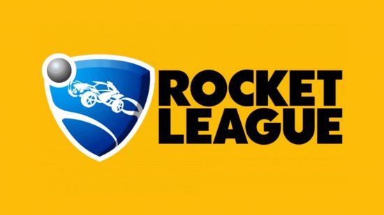
Just like everything in graphic design, the Rocket League logo pushed for simplicity with its pseudo-Futura logo change in 2015, alongside the football team crest with a car flying through it. It’s bold if a bit lacking in personality.

Rocket League logo 2020
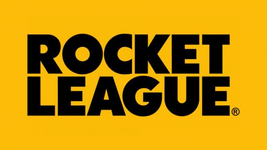
By 2020, Epic Games’ owned Rocket League, as they do now. The logo lost the football crest and is now used on its own next to seasonal changes and whatnot. The name is still there, bold as ever, and changes color in press materials based on different in-game events.
There you have it, the Rocket League logo through the years. For more, check out our guide to the best portable gaming consoles to pick the best tech for the job.